Fastest and freshest coffee that kitchens had never seen.
PARACHUTE COFFEE
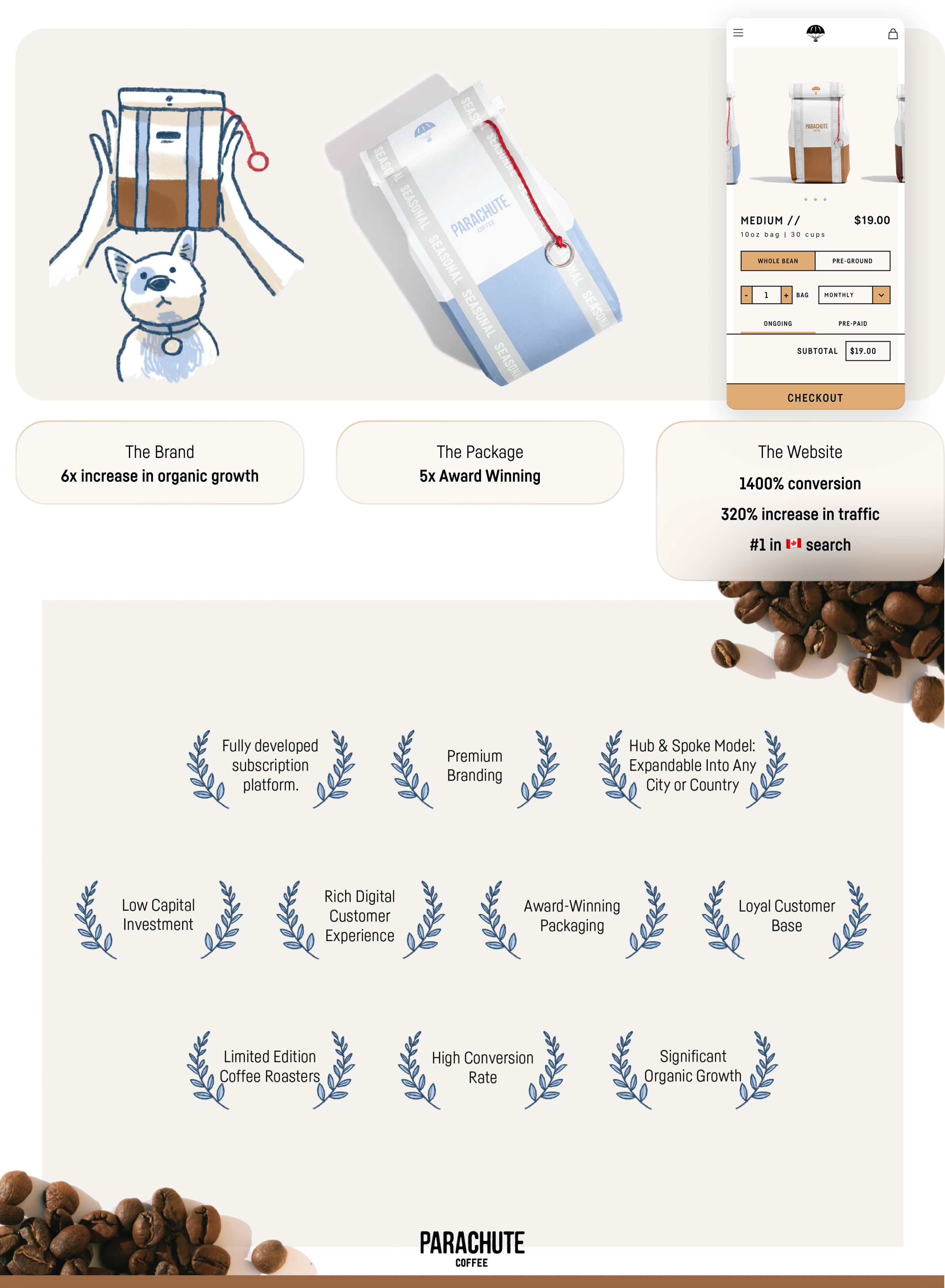
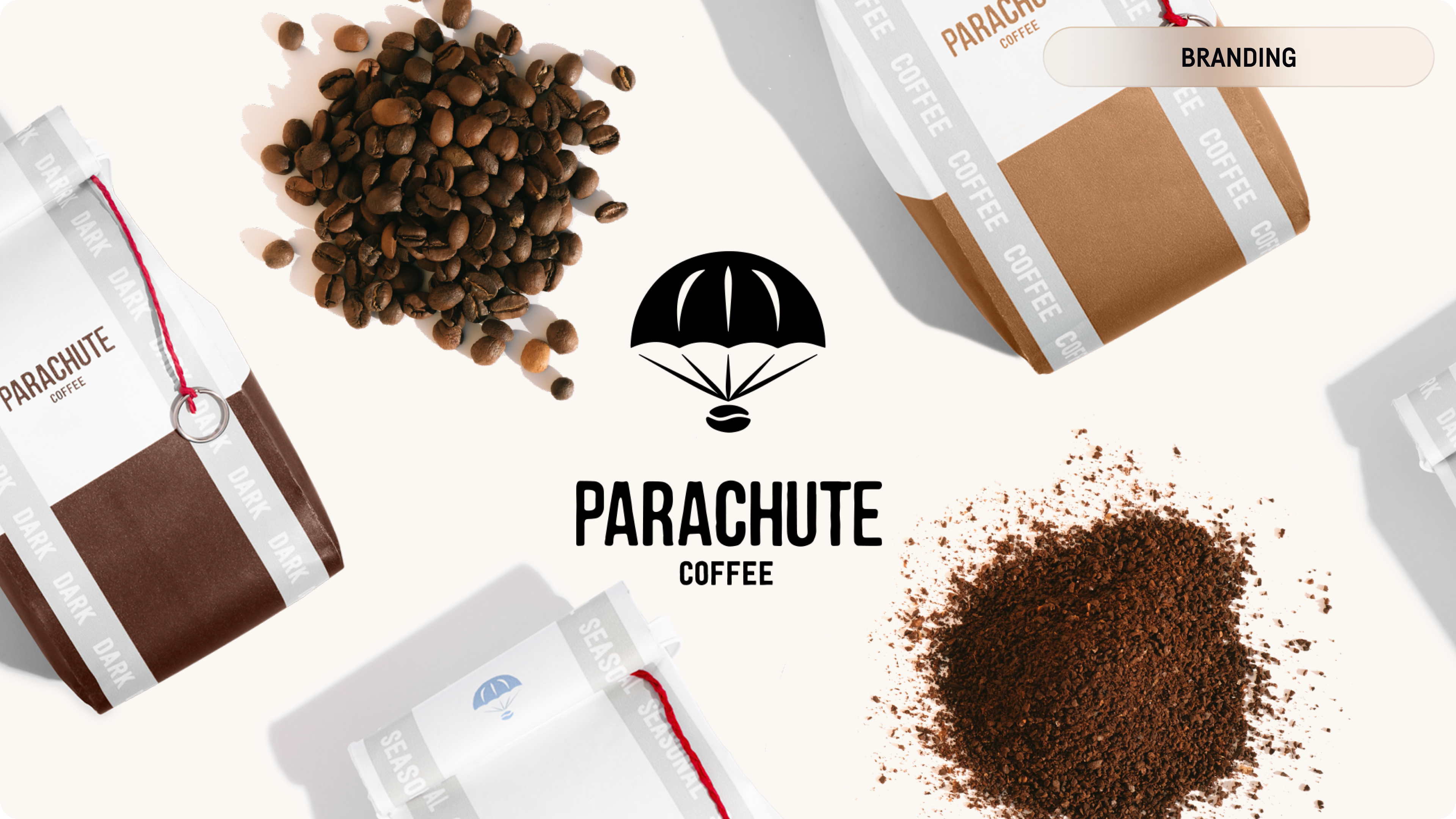
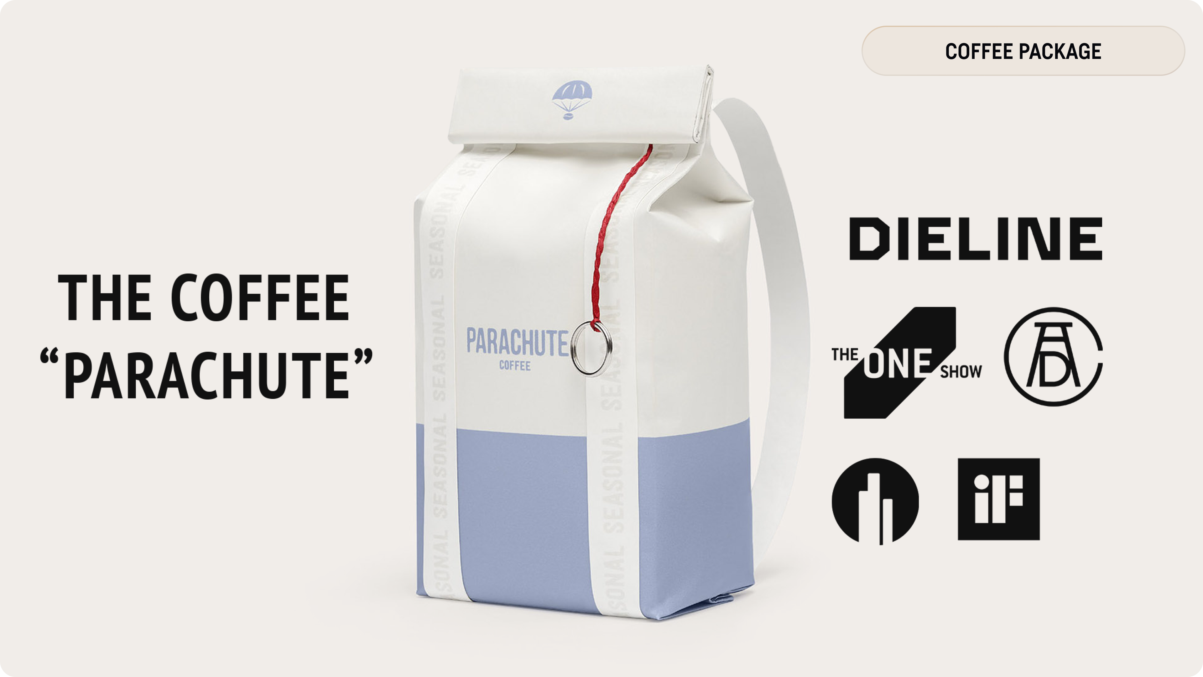
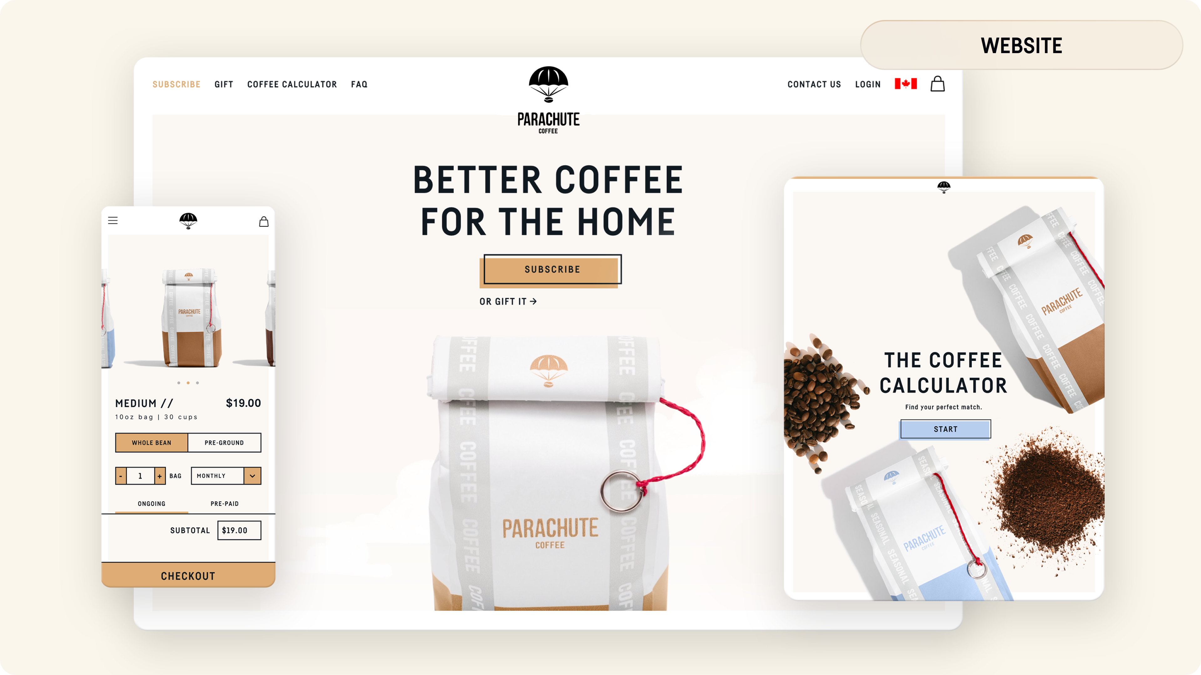
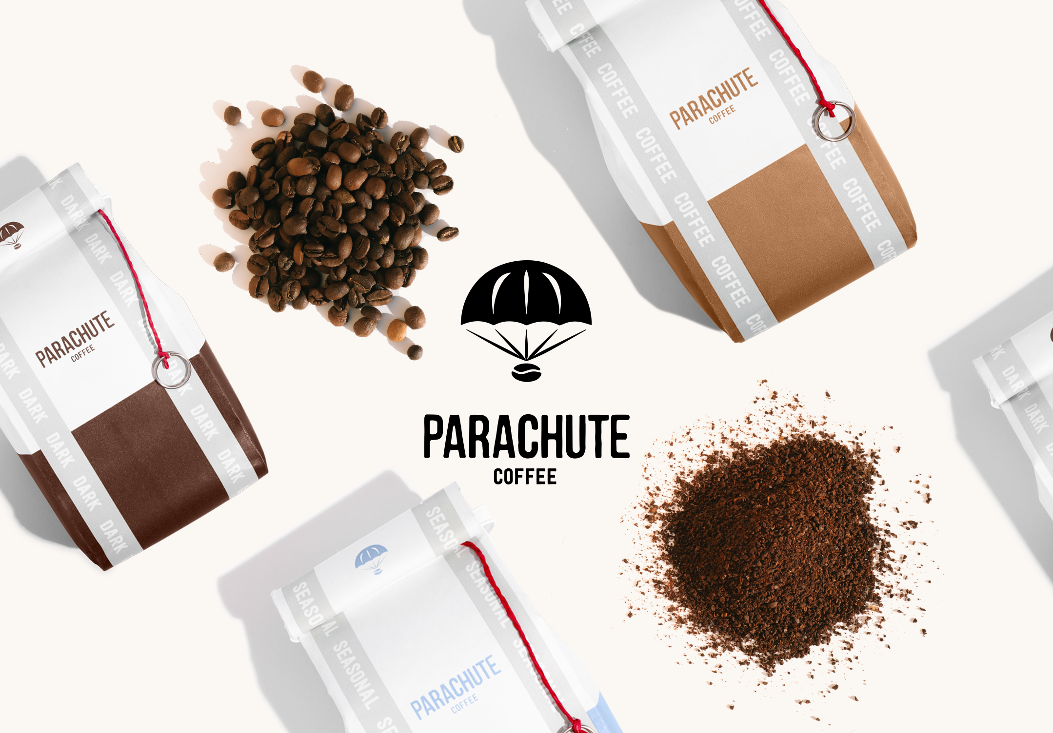
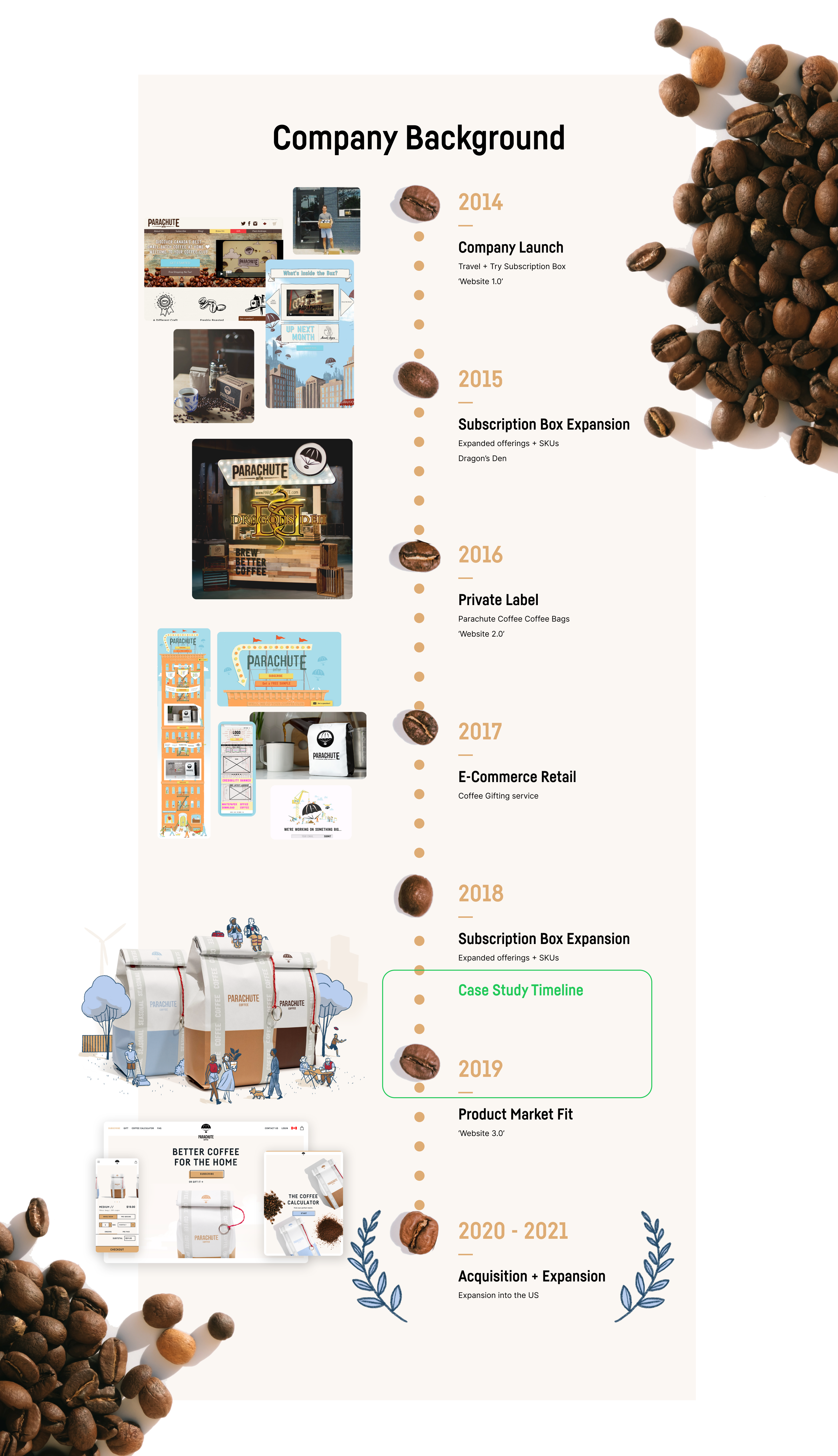
Parachute Coffee is an online subscription service that ships coffee to people's doors faster than anyone else. The goal we succeeded in was to get freshly roasted coffee to the customer's kitchen conveniently and on their schedule and become Canada's #1 coffee subscription which we accomplished before the company was acquired in 2021.
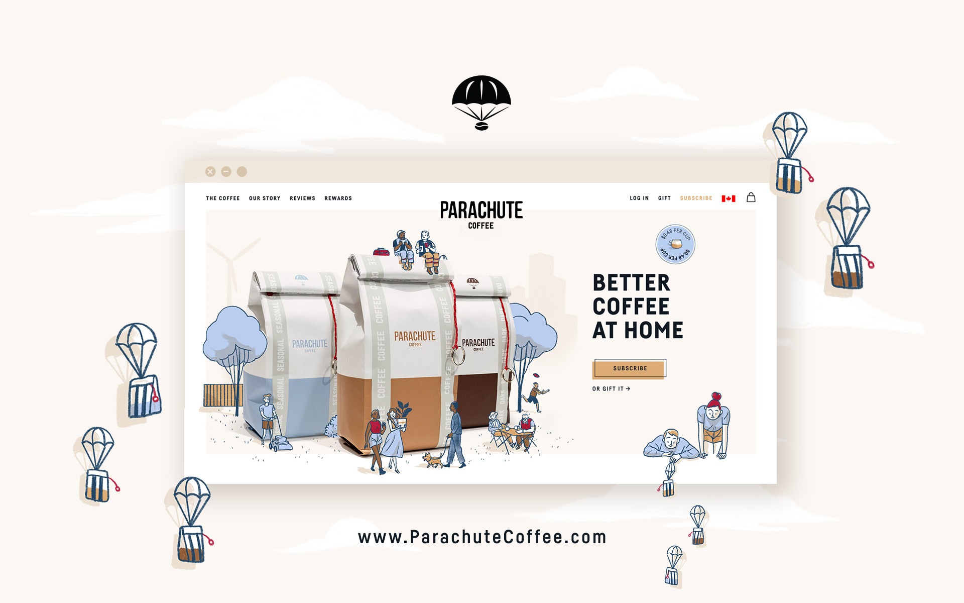
CASE STUDY // 2019 - 2021
Parachute Coffee Co. Brand 3.0
Role
Creative Lead + Product Designer
CO-FOUNDER
Services
Logo Design, Design Strategy, Design System, UX/UI, User-Flows, Product Design, Website Design, Photography, Illustration, Copywriting, Art Direction.
Tools


Approach
I used the Double Diamond Design Process, mapped out by the Design Council while slightly adapting it to capture some valuable elements of The Design Sprint Kit by Google, specifically 'empathize' and 'reflect.' This keeps a very human-centred approach to the design process while allowing for a breath to take big-picture glances.
🔍
Discover
• Deep Dive
• Research
• Insights
❤️
Empathize
• Understand Users
• Brainstorm
• Gather Feedback
✏️
Define
• Problem
• Insights to Ideas
• Create Vision
💡
Develop
• Ideas to Reality
• Execute
• Test
🏁
Deliver
• Implement
• Ship / Print
• Finalize / Iterate
💬
Reflect
• Review
• Learn
• Improve
All ideas are challenged against the Leo Burnett HumanKind Scale.
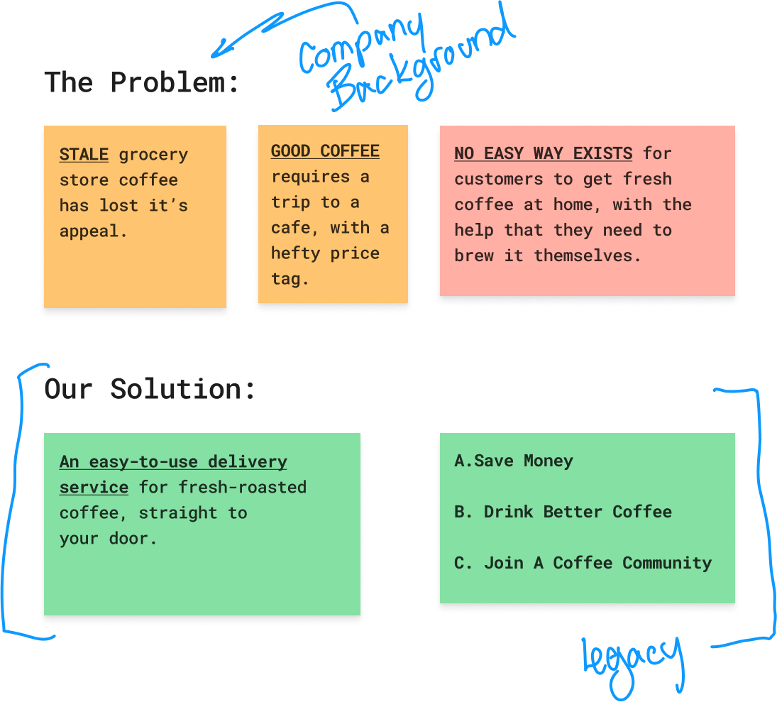
🔍 A high-risk opportunity to rebrand coffee
People have strong opinions
when it comes to their coffee
The last thing you want to do is get someone's coffee order wrong.
That's why when it came to a drastic new overhaul to the entire Parachute Coffee brand we needed to do extensive research at every avenue.
Comprehensive Brand Analysis:
Audited Over 30 Competitor Websites and Packaging Designs
—
In-depth research, documented with detailed files for each business,
comparing demographic, branding, UX, user flow, and packaging.
❤️ Understanding sacred habits
A rare study opportunity
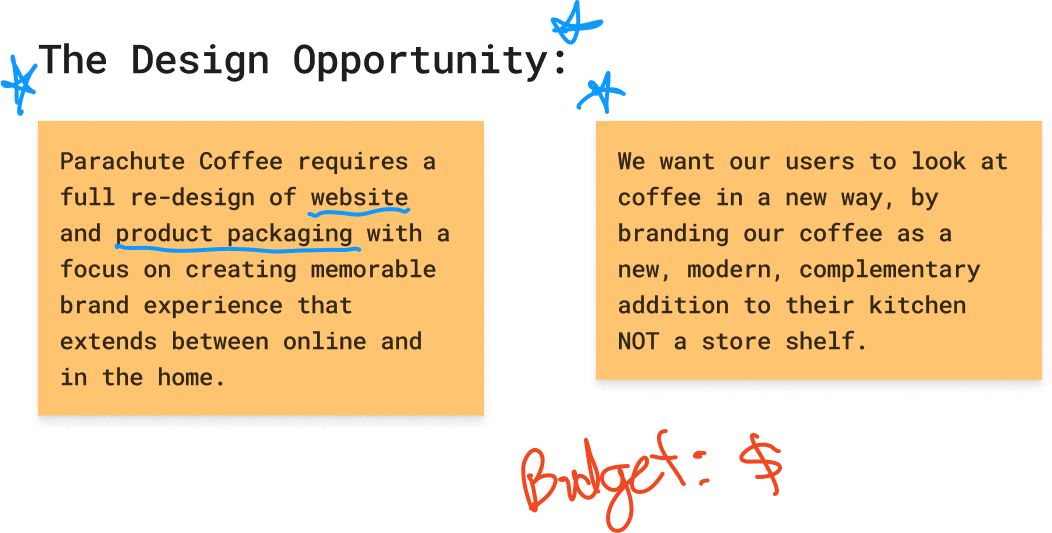
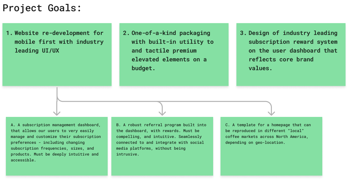
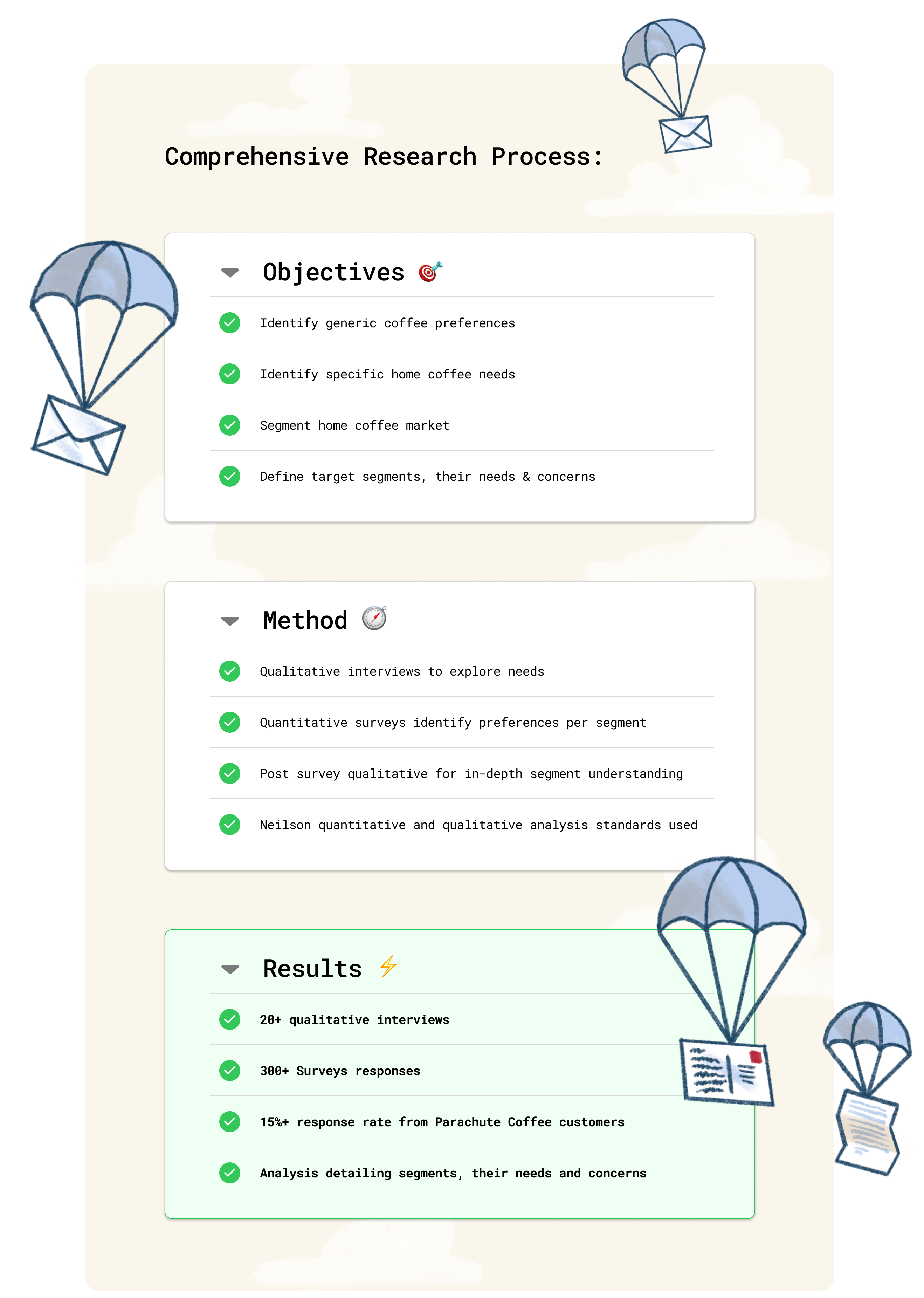
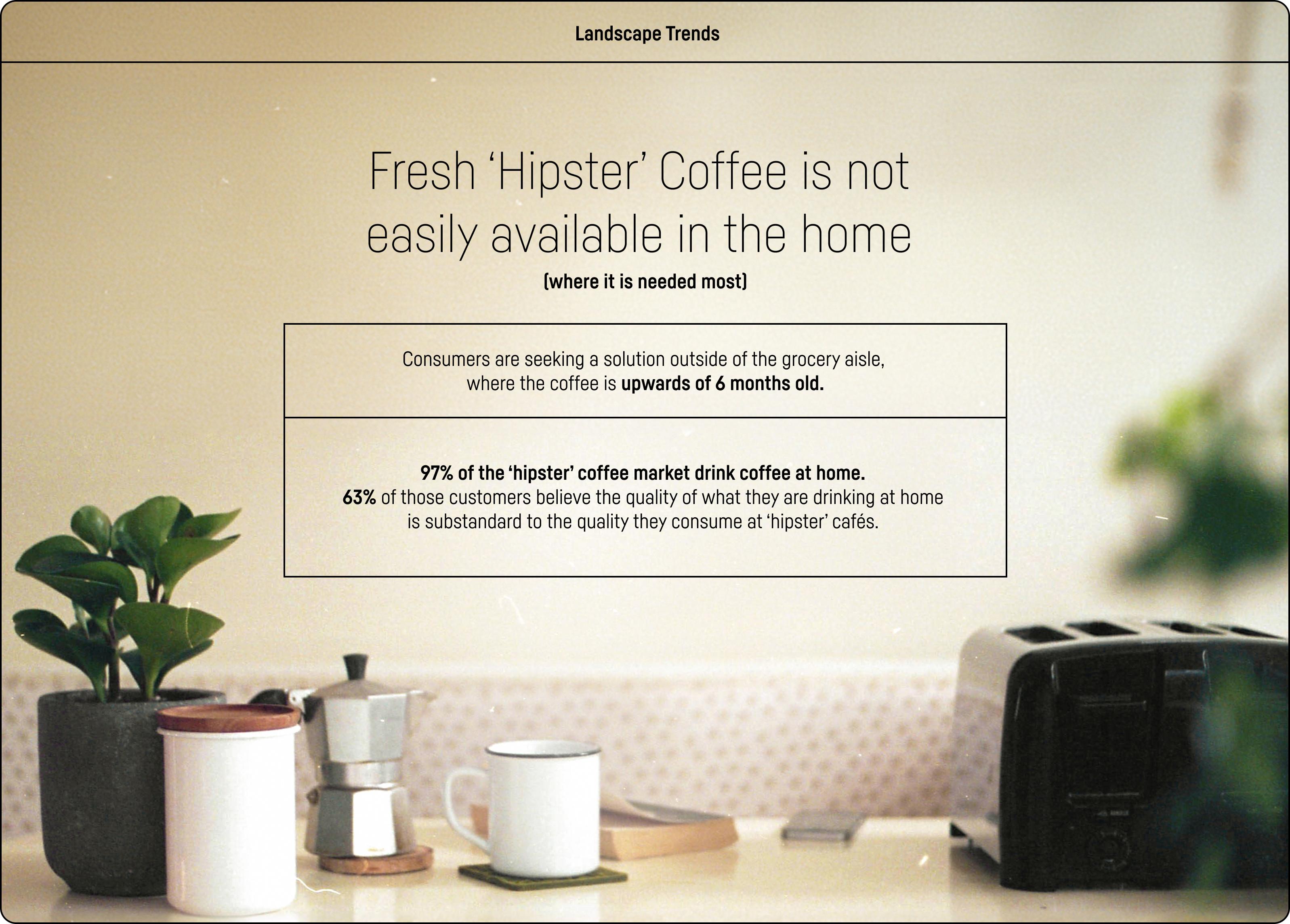
When we began researching we discovered there was extensive information about commercial coffee trends and a stark absence of at-home coffee habits. We reworked our scope to include time to produce this in-depth research ourselves.
✏️ Freshly brewed insights
We're gunna need a bigger budget...
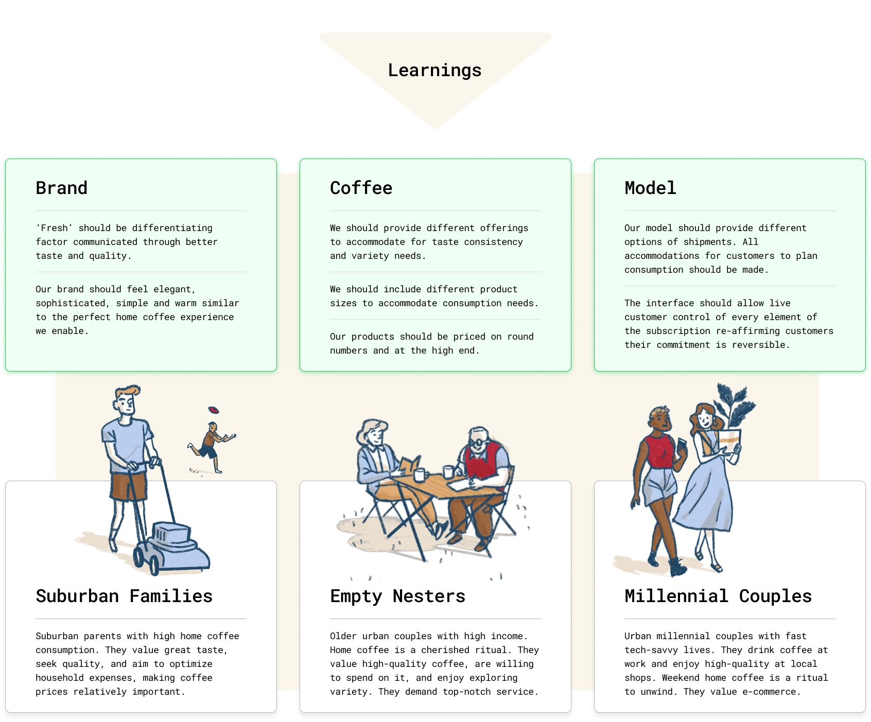
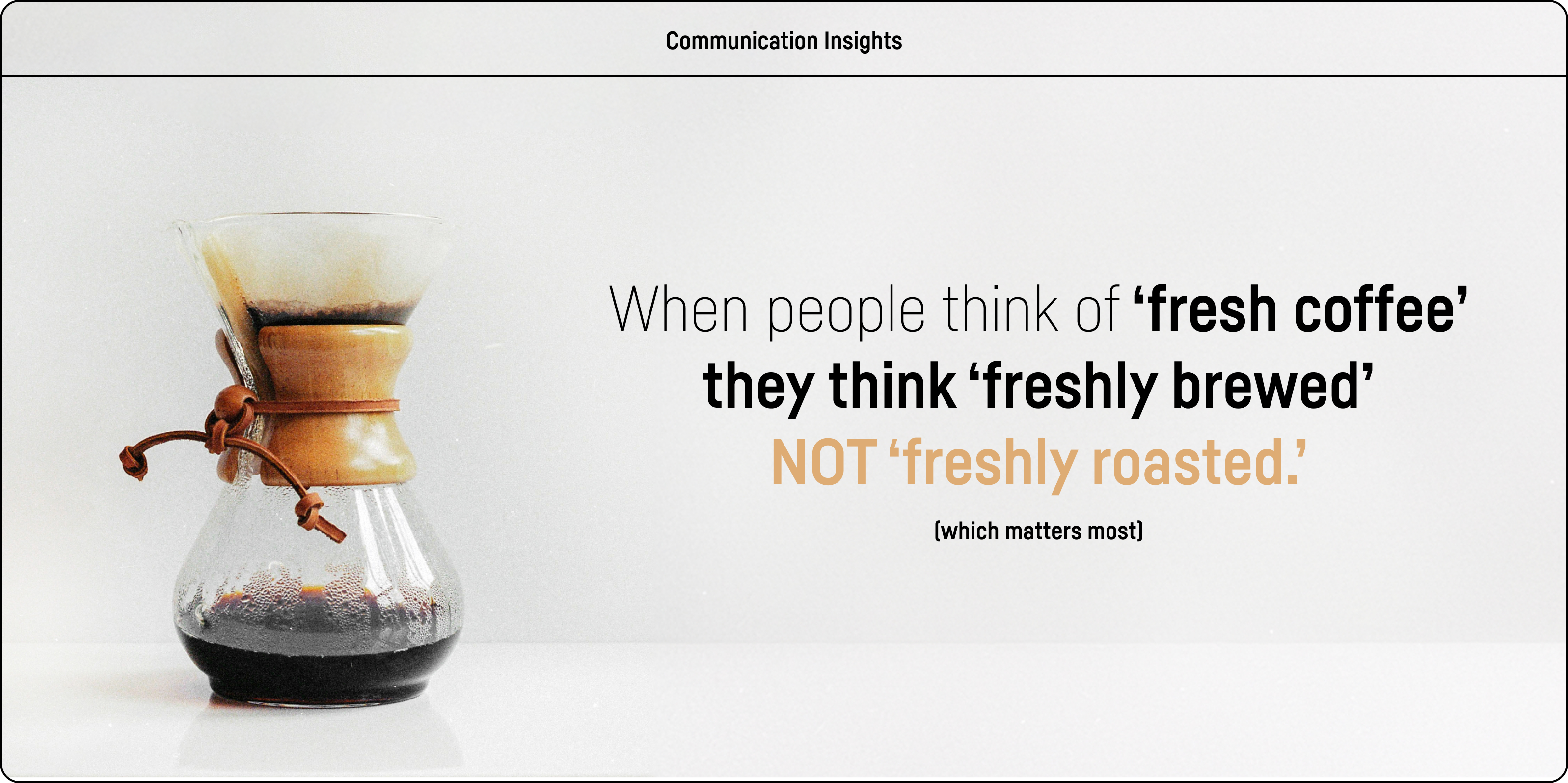
After an overwhelming response to our survey and research, it was
re-inforced that there was a deep desire for 'quality' when it comes
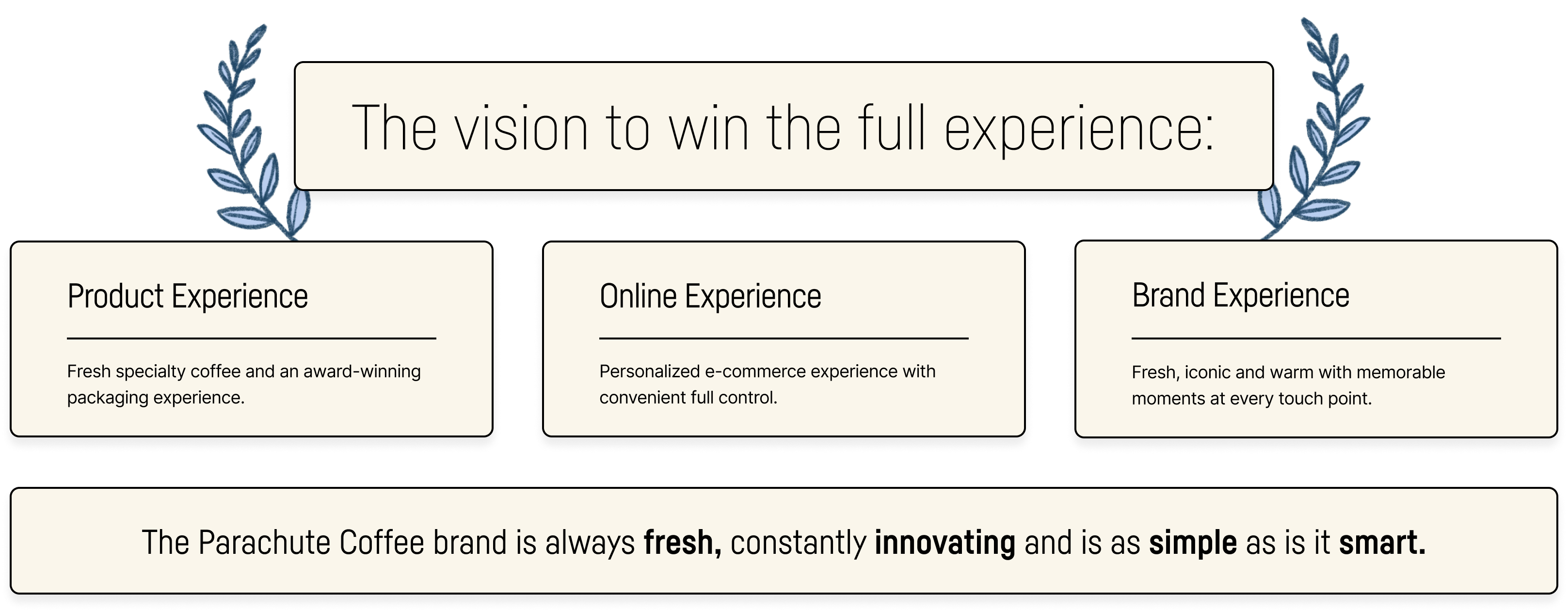
to the full user experience, not just when it comes to the customer's cup.
The biggest challenge was now staying within budget.
💡Packing the Parachute
Making every element perfectly
set up for a flawless deployment
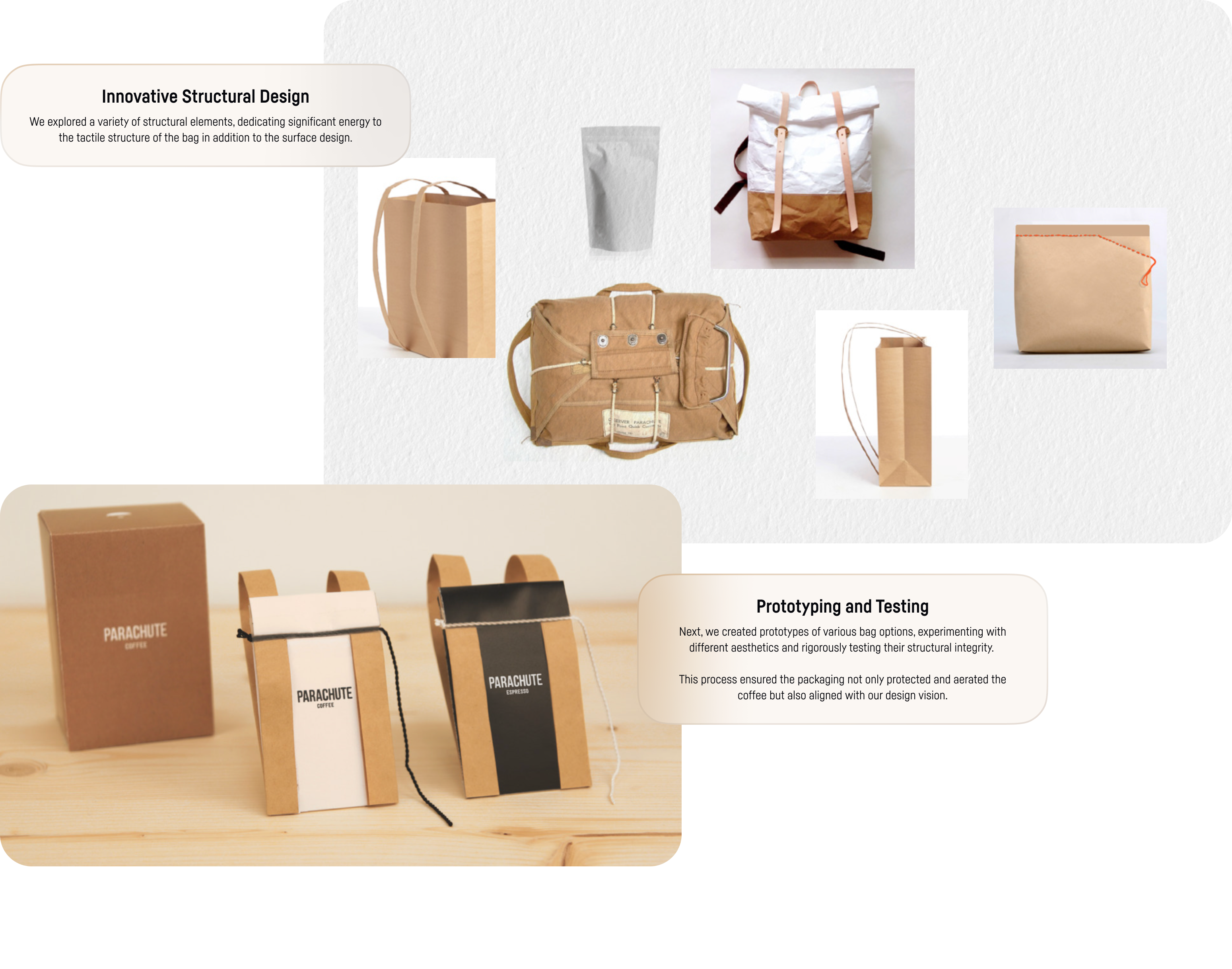
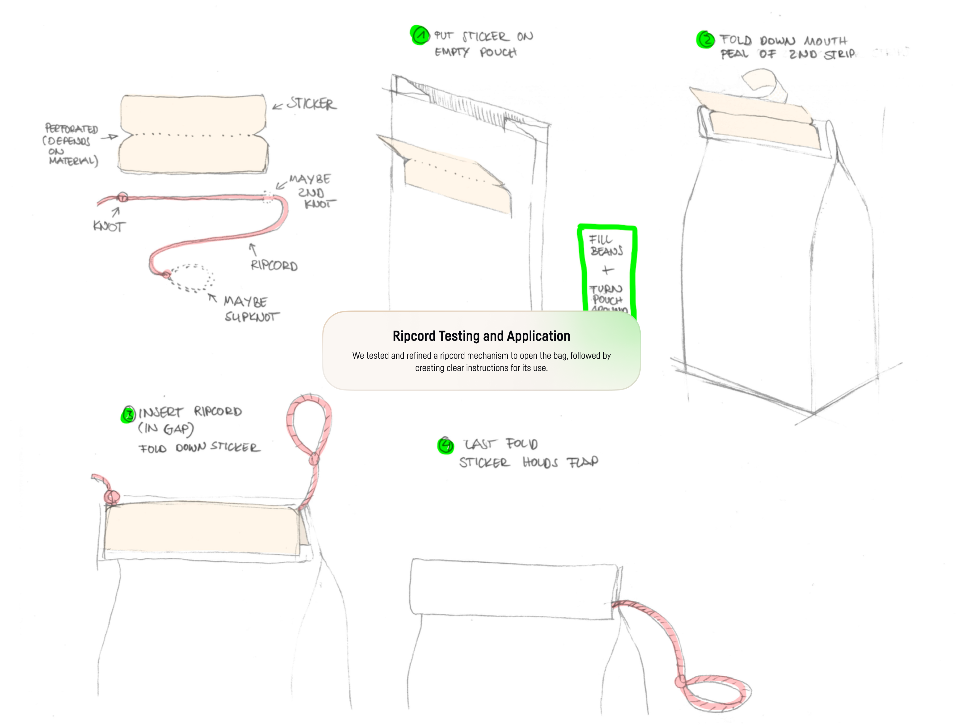
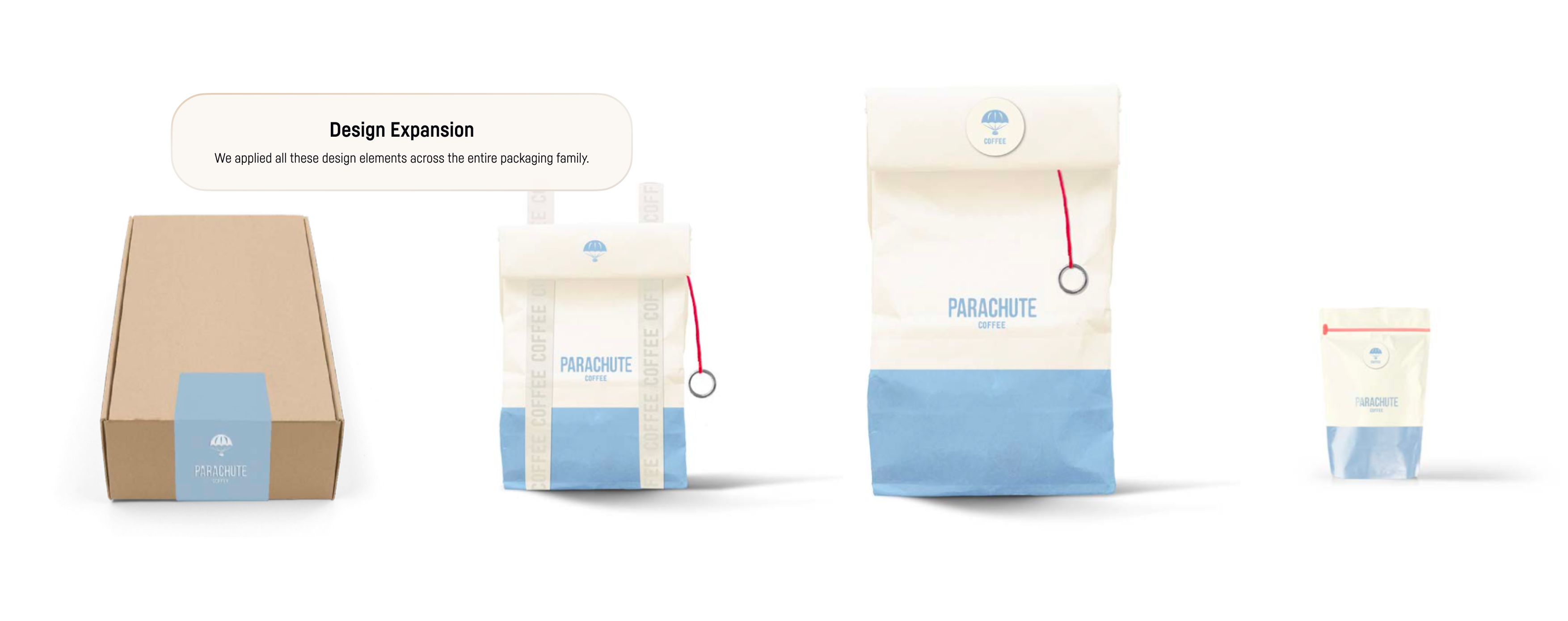
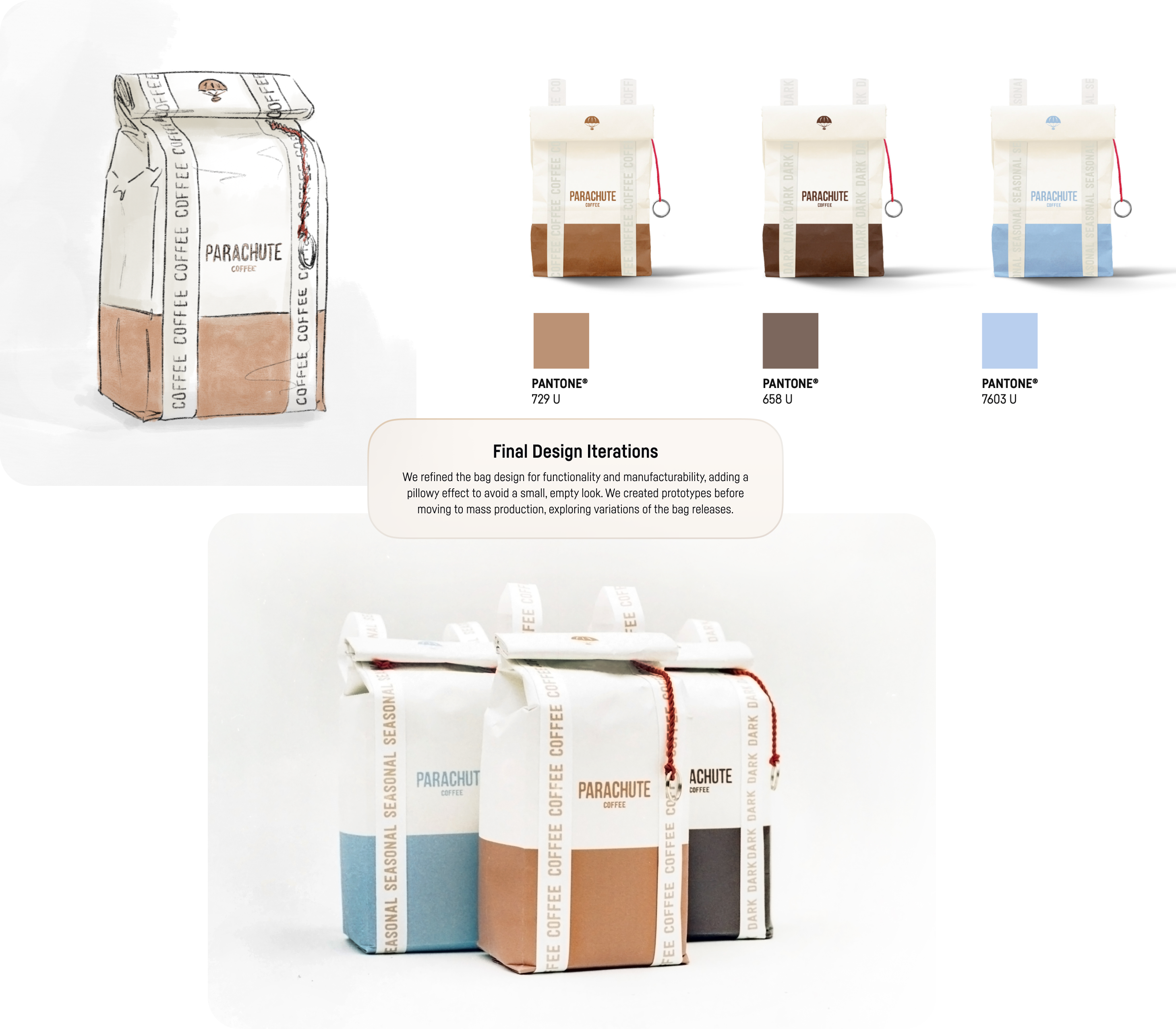
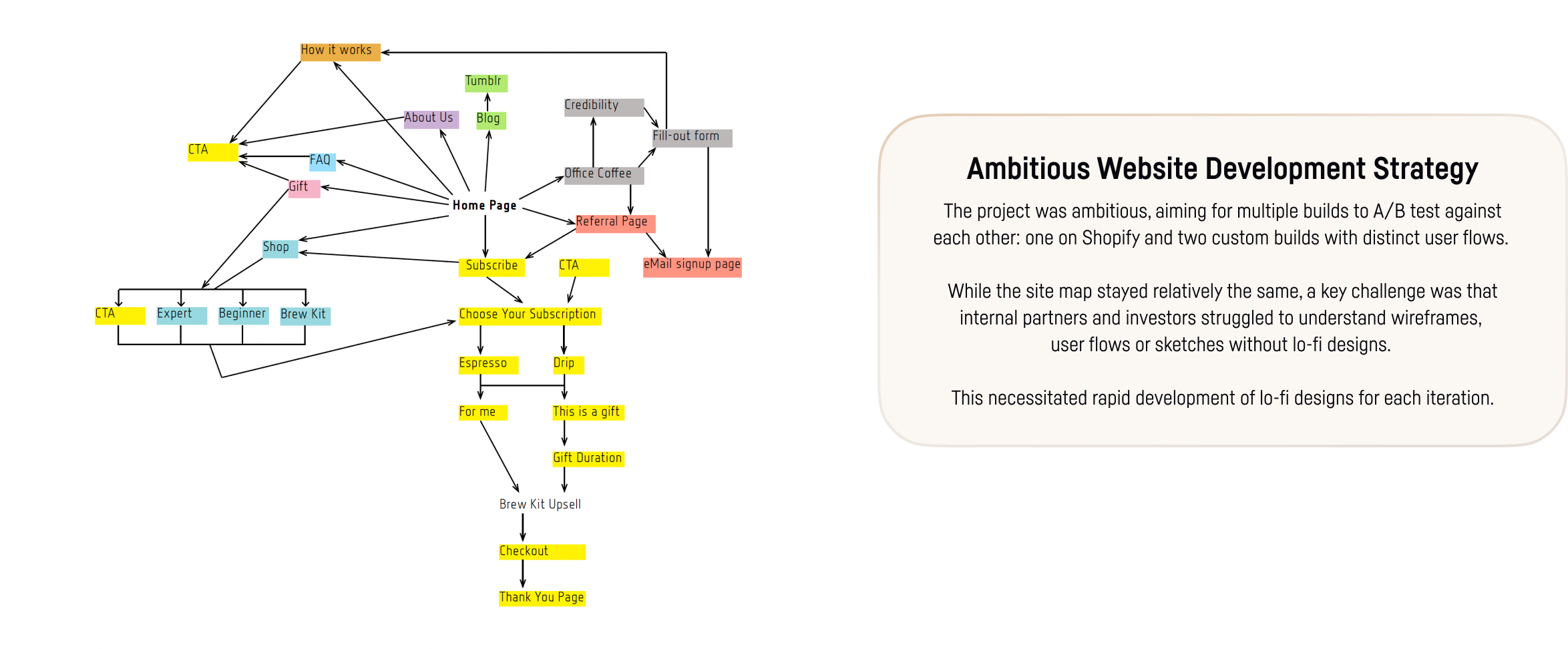
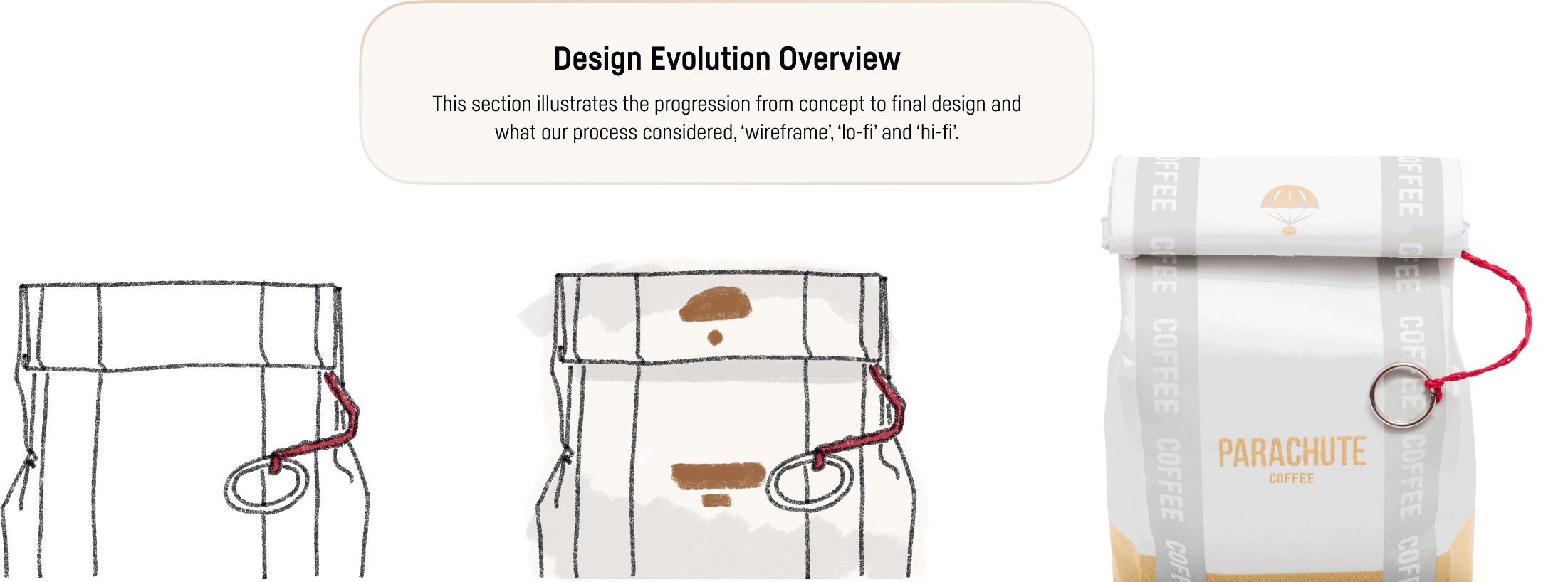
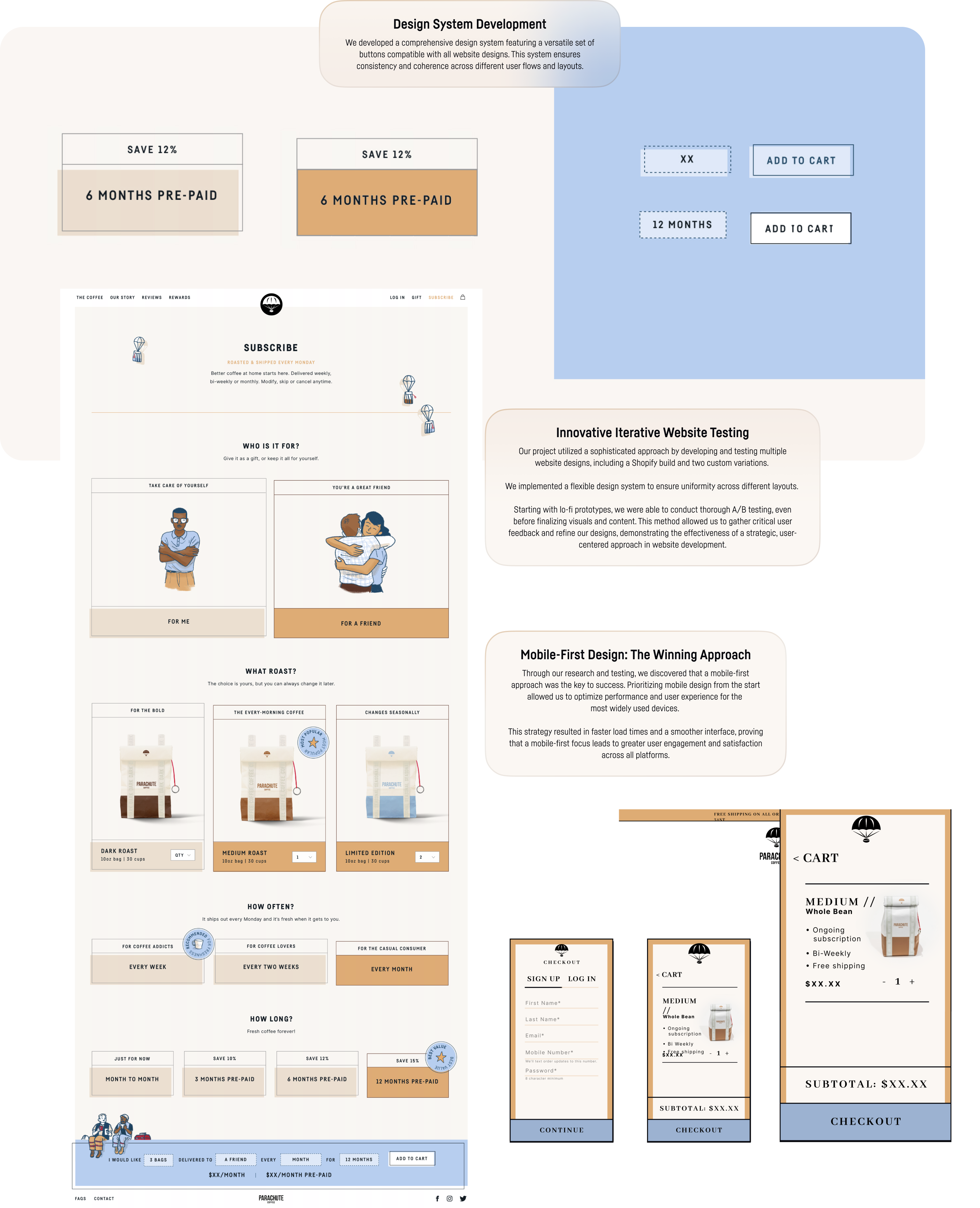
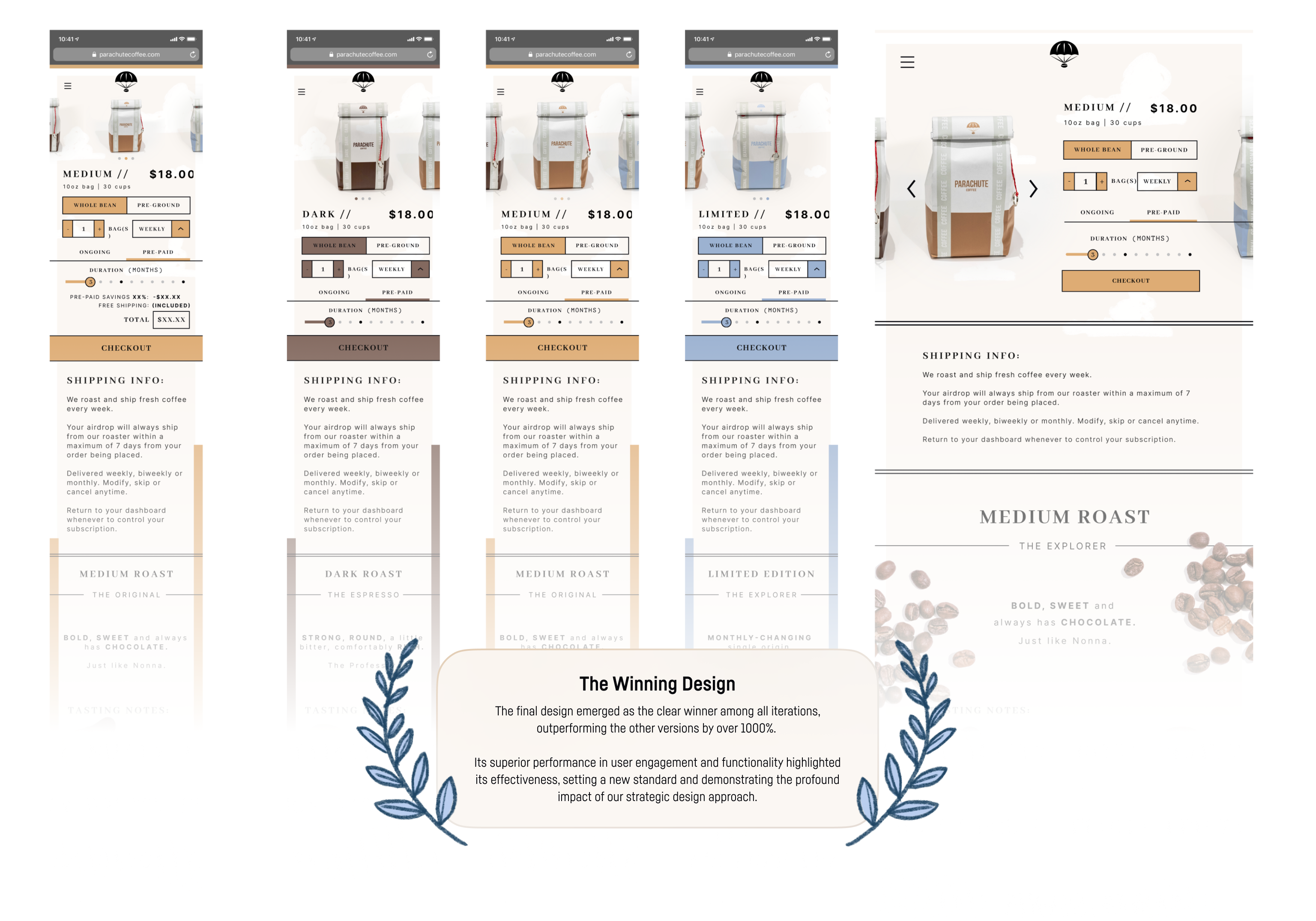
Our development phase involved creating and testing multiple website designs, including Shopify and custom builds, with a versatile design system for consistency. Building in tandem, illustrations, photography, multiple websites, and coffee bag packaging. This process underscored the value of rigorous communication between cross-functional teams.
